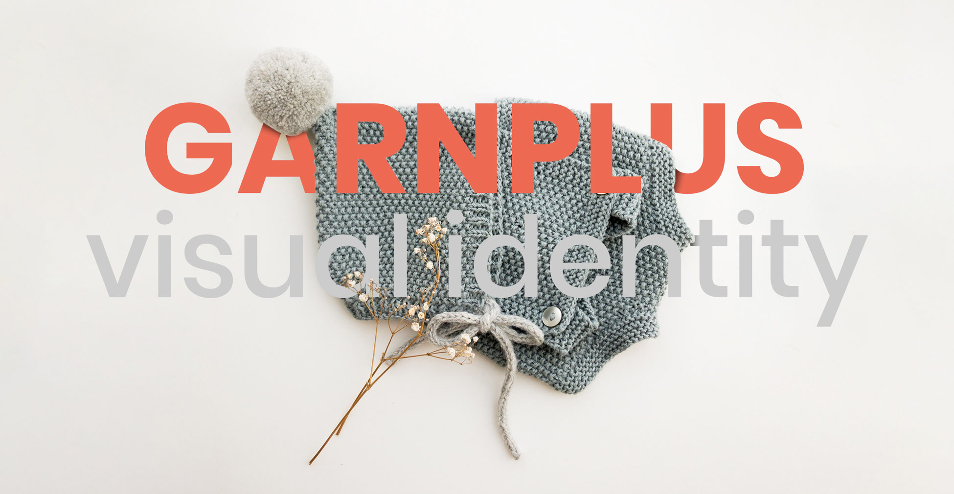
During my employment at Group Buy ApS I had responsibility for creating the logo and a full visual identity for a new shop called GarnPlus. The shop was created to sell yarn directly to customers.
Task – It was important that the CVI should signal comfort and warmth. The logo should be adaptive and should be used in different formats for different functions.
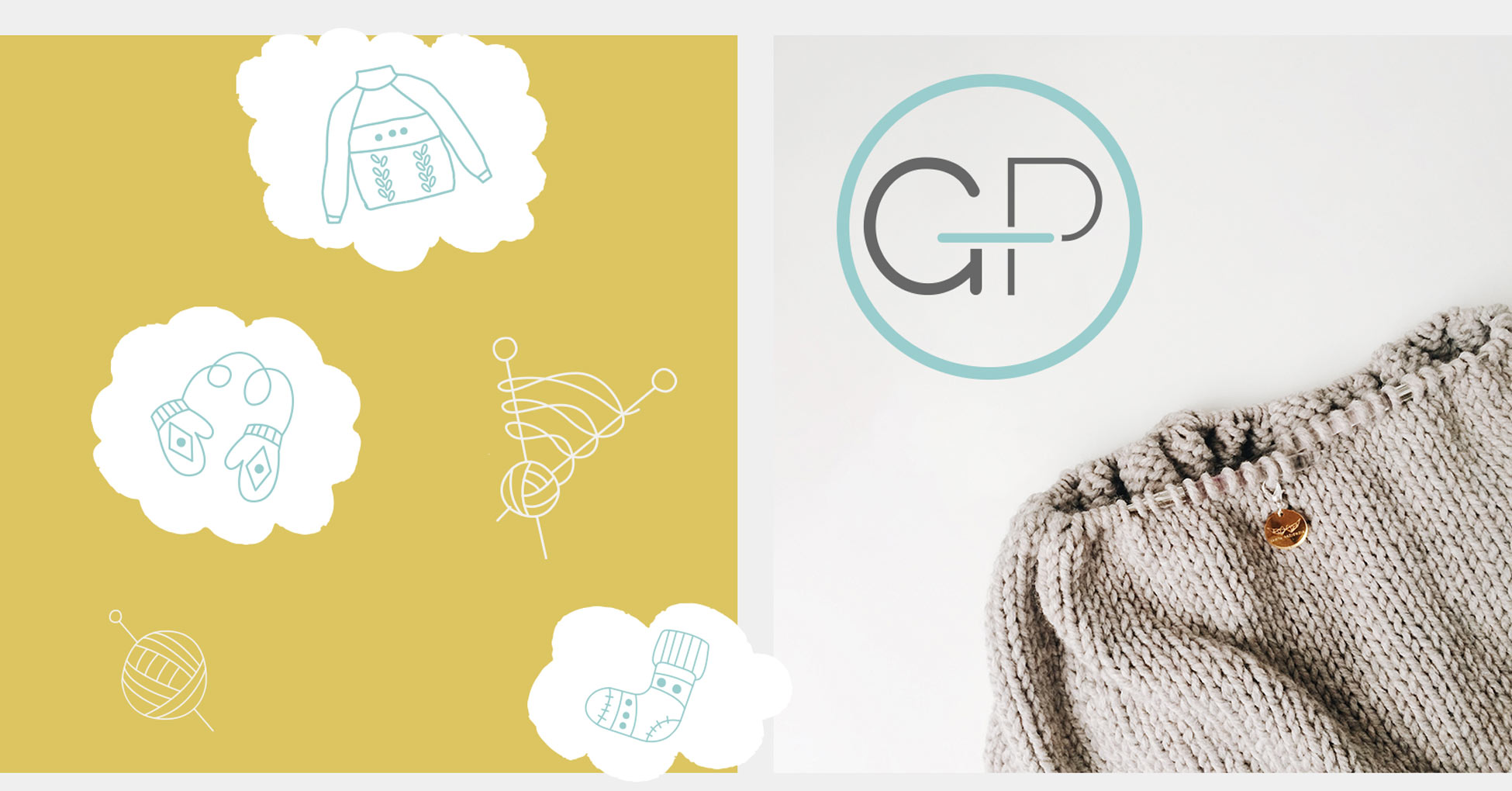
Logo & Elements
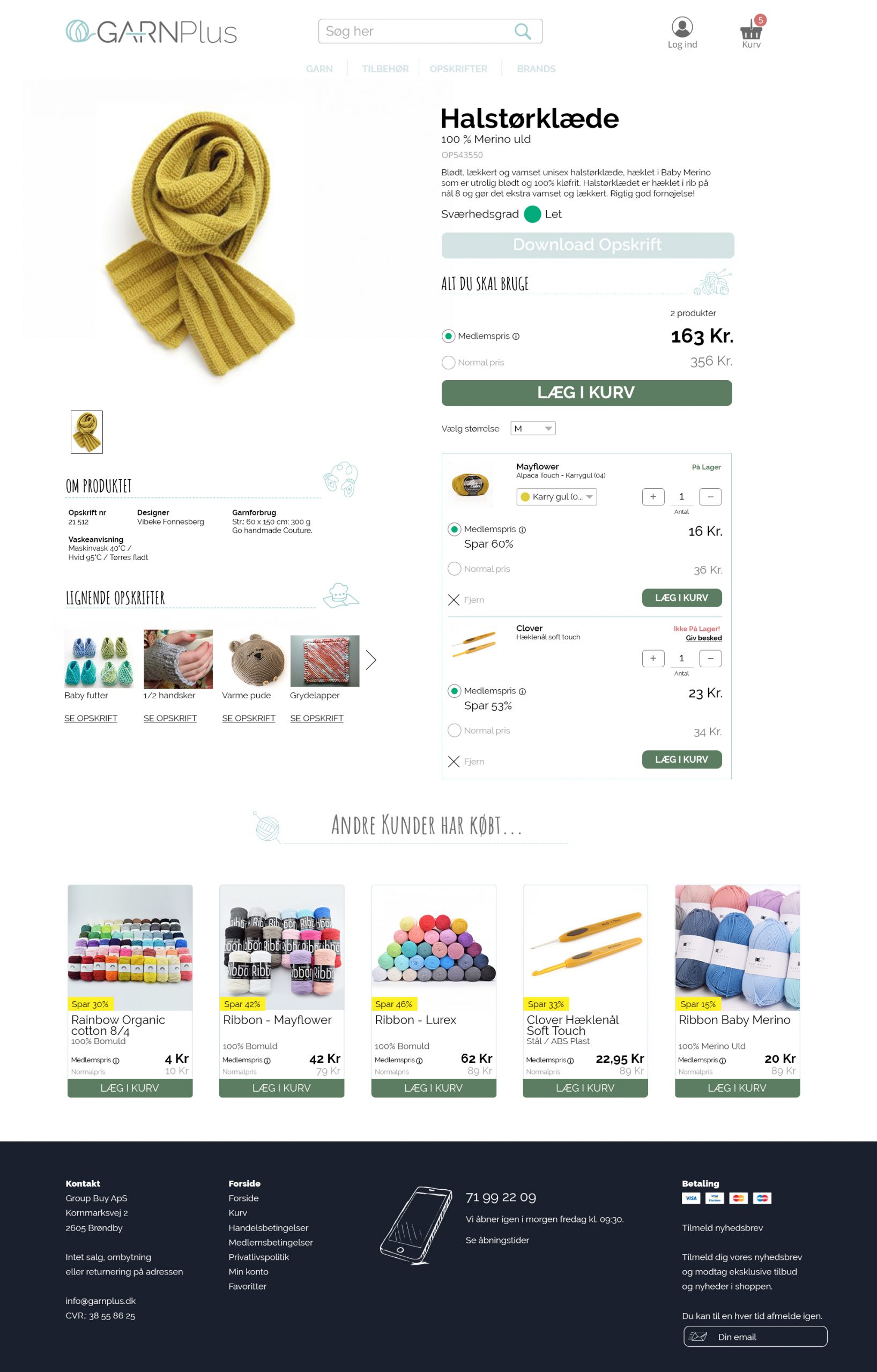
The site
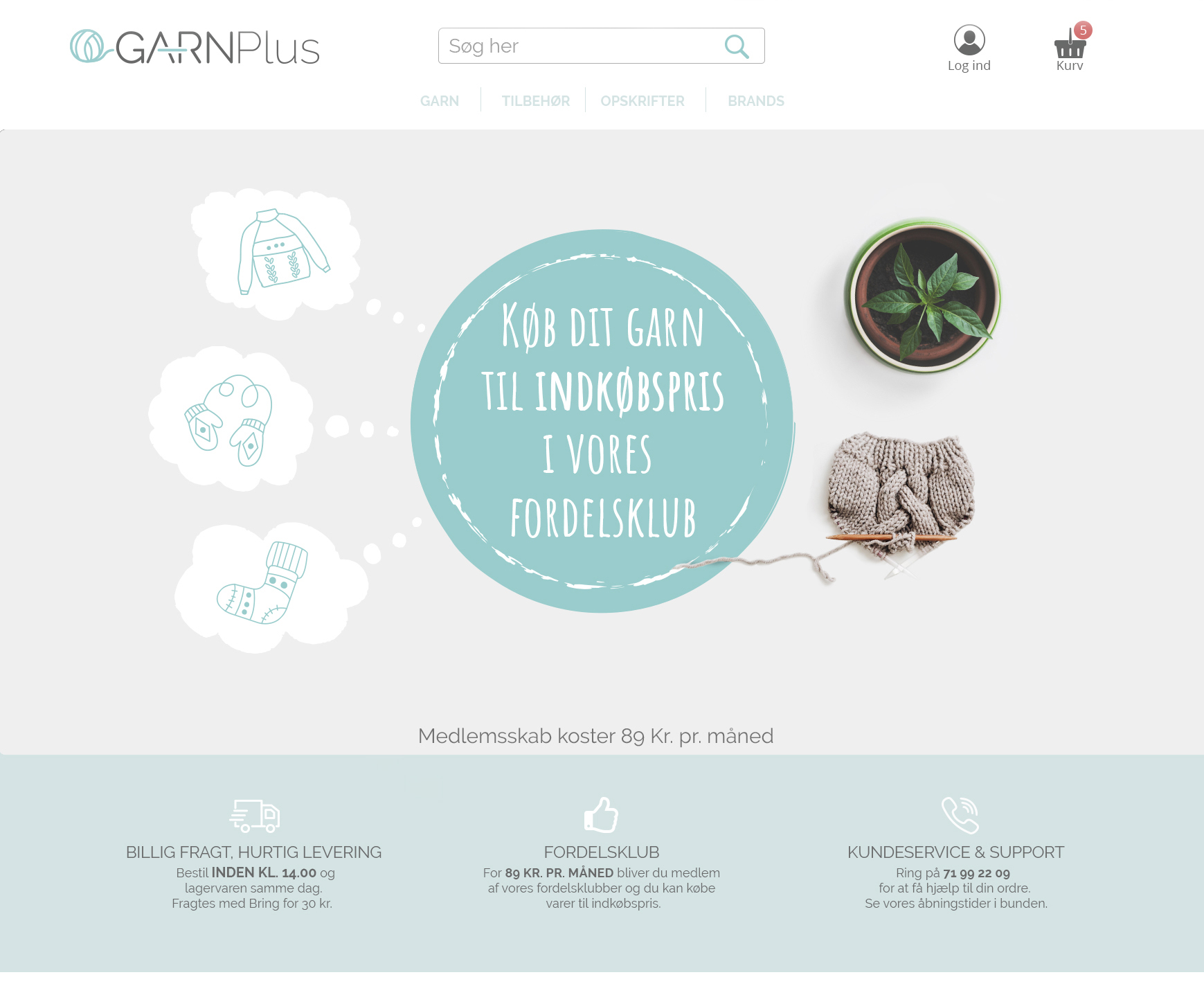
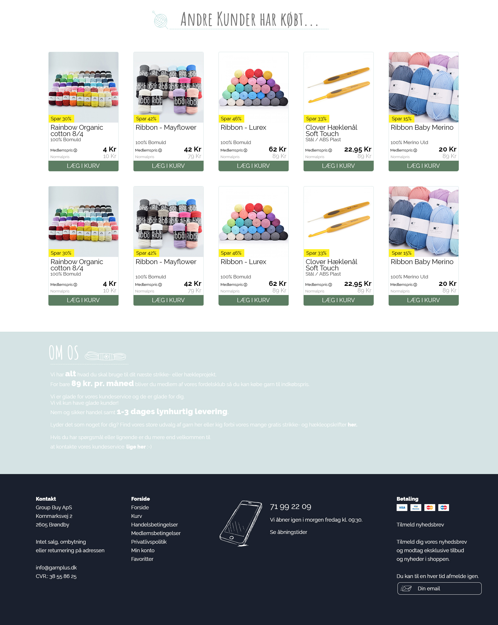
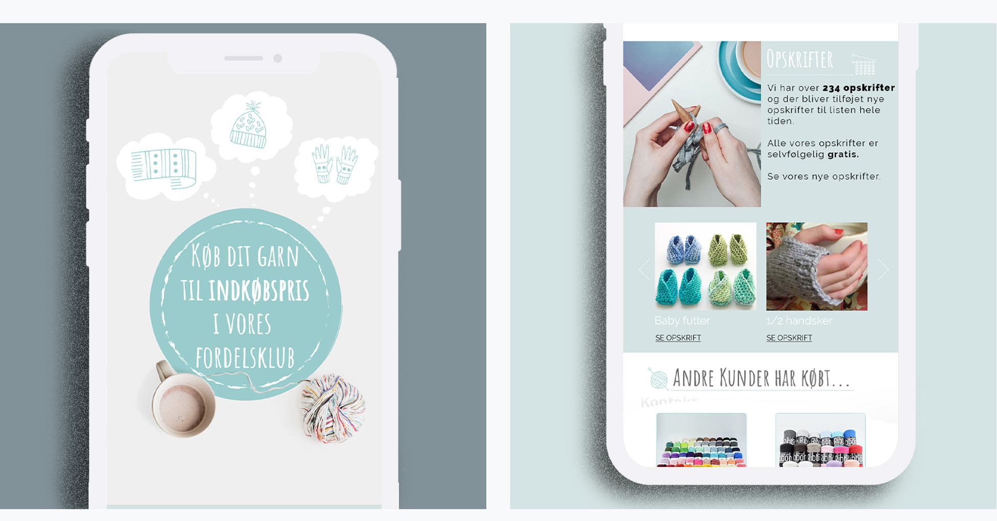
I have improved on warm feeling from the colors with the introduction of the thought and handdrawn elements which materialises in a physical knitted product on the landings hero.
The fonts I have used are a mix of a handdrawn font from google for the header texts and railway, a more readable font for product cards & longer text passages. The choice of railway was taken partly because of the combining of the f and l in the word mayflower, which is a big supplier of yarn, and the numbers are a bit uneven and therefore more charming.
Colors
The primary colours are a light blue, a more feminine approach to a masculine color. The idea behind the color scheme are reminesant to old photographs and therefore the memory of something fond and warm.
# d4e3e3
# 99cccc
# efefef
# 686969
# 1a202d
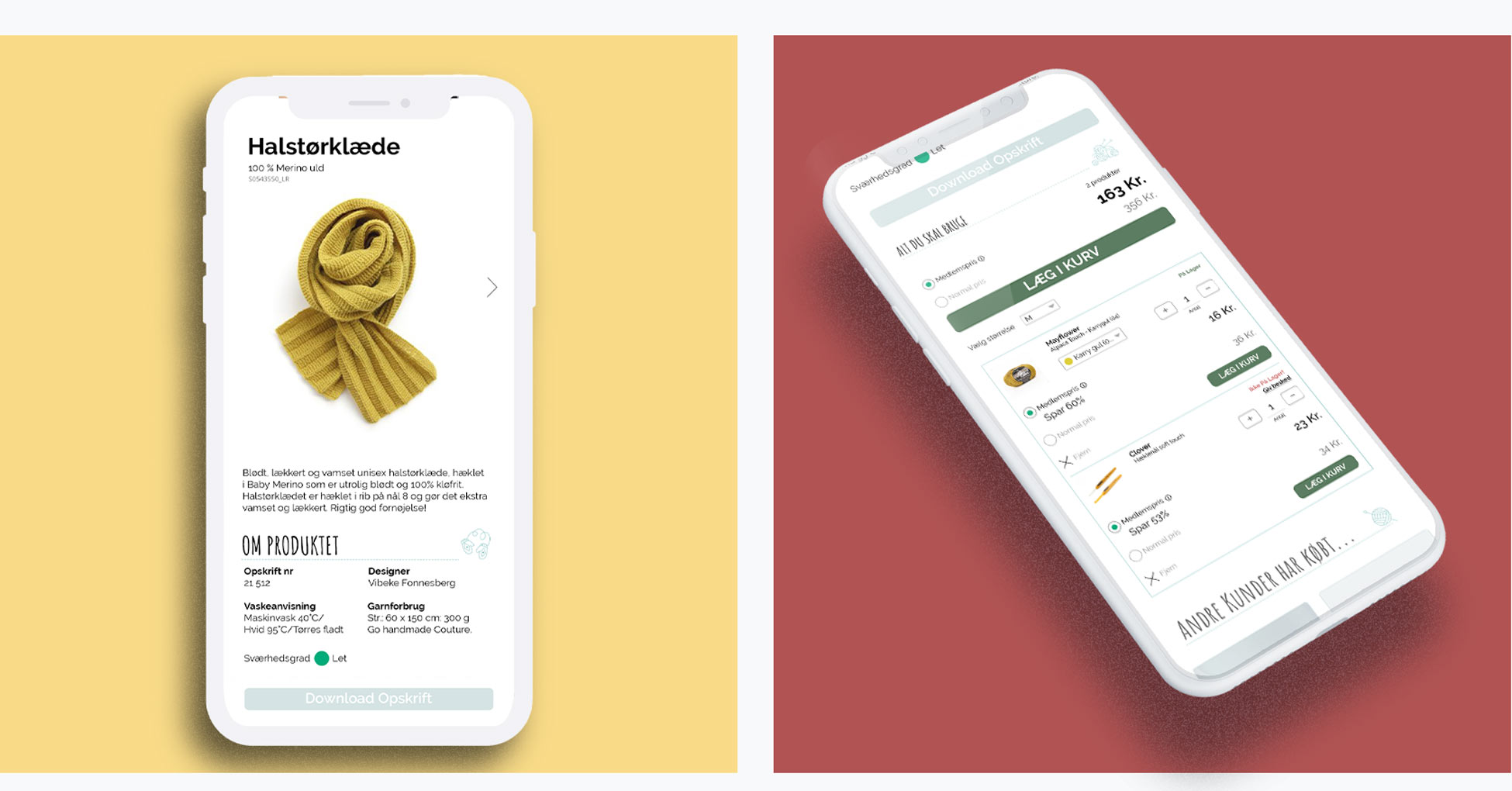
Product page
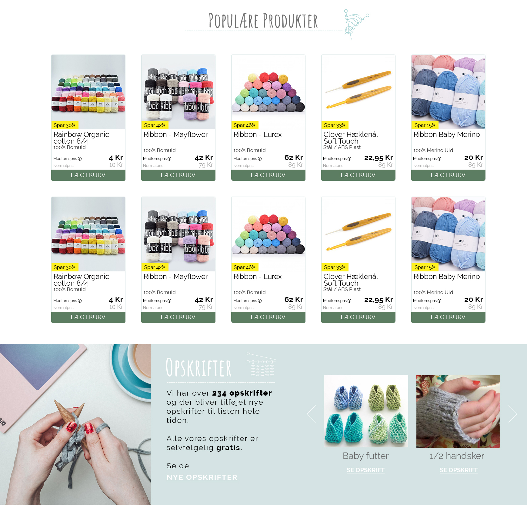
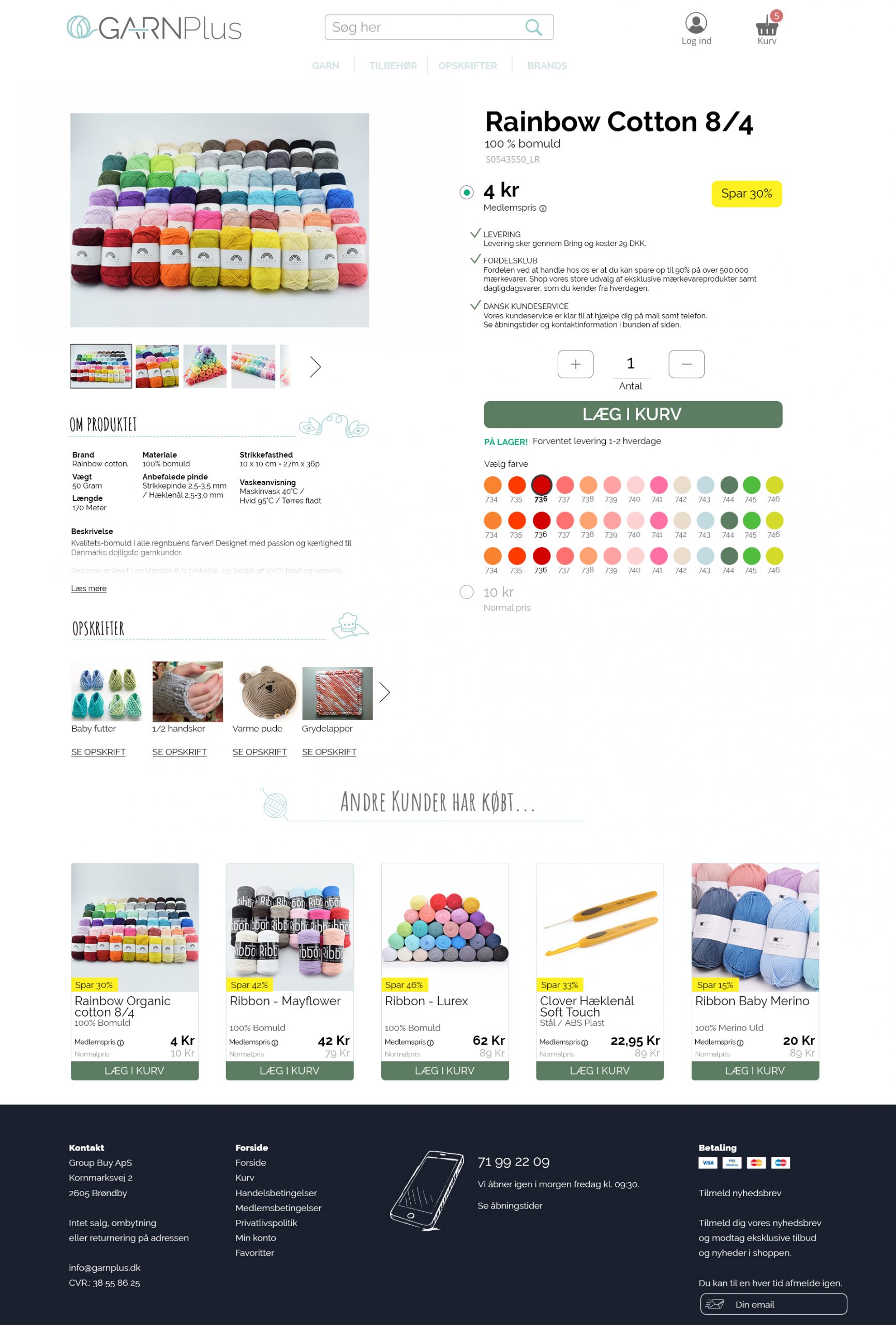
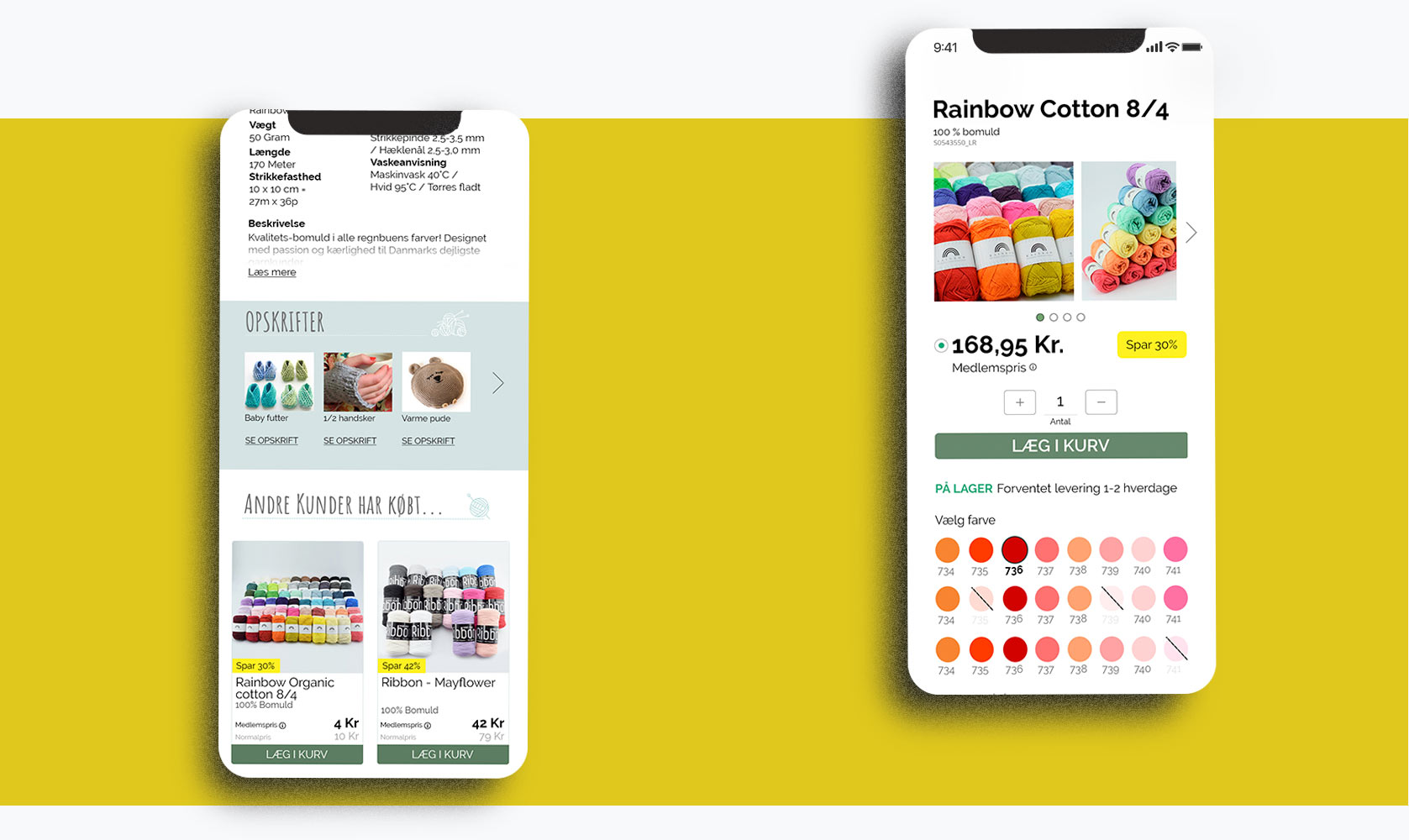
Most of the customers are coming from google, so the product page are what most users see when they encounter the shop first time. It was important that the user should be exposed to recipes and therefore the possibility to up sell other products.
Recipes
In order to upsell more different products there should be a recipes page. The user should download different recipes and in should buy the different items needed in the shop.
