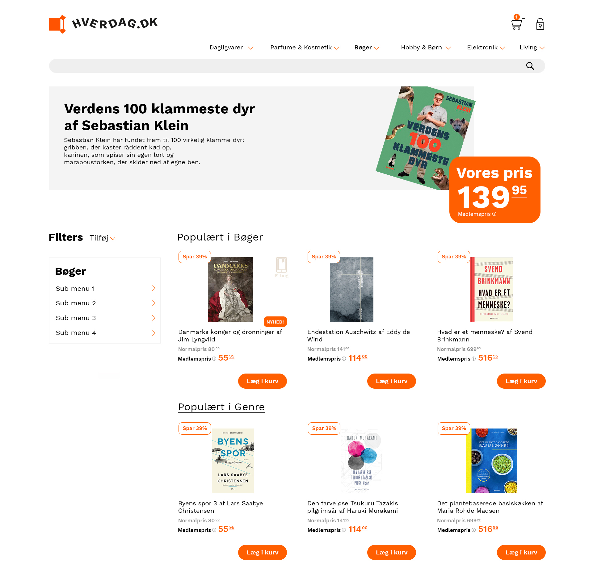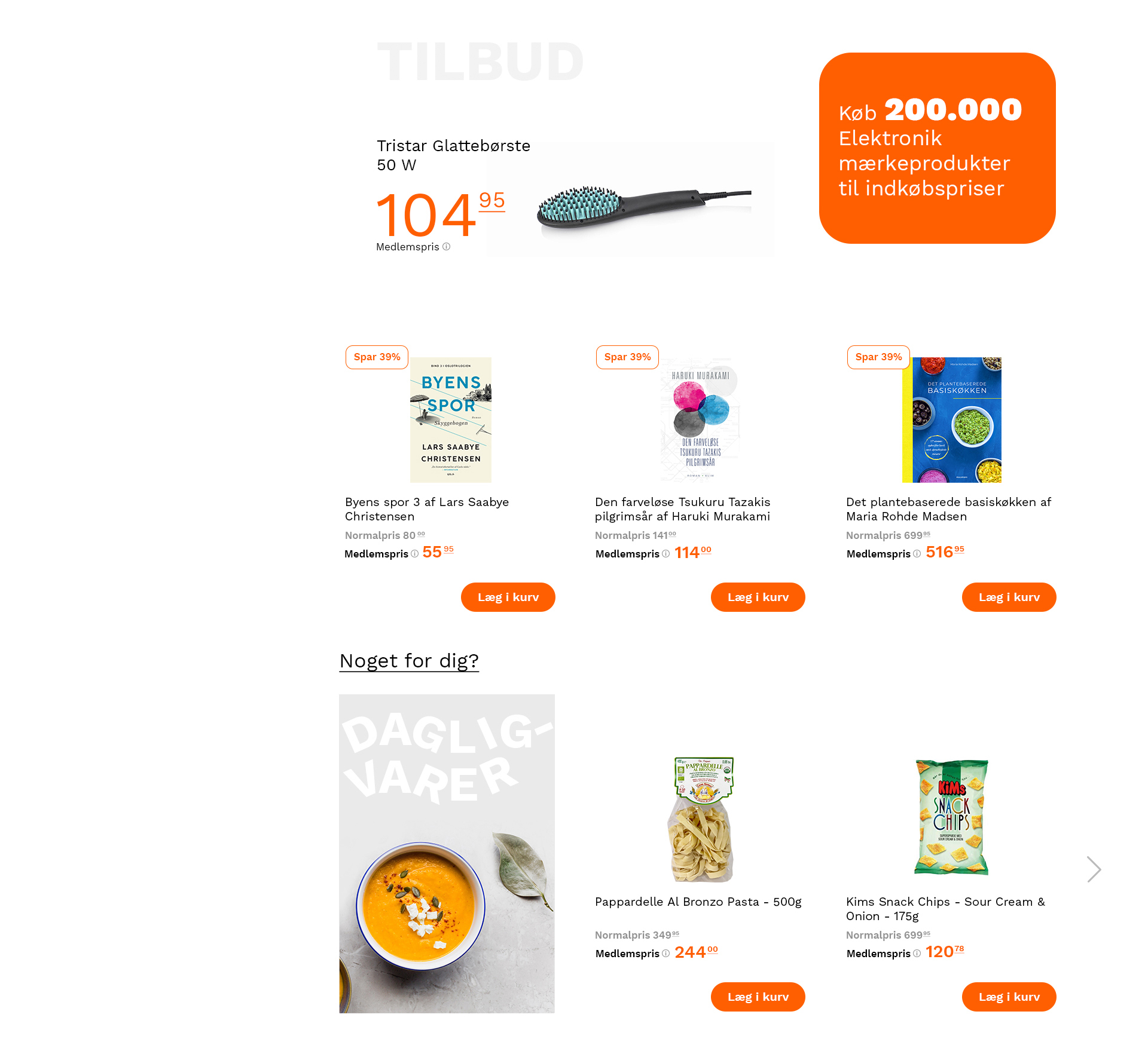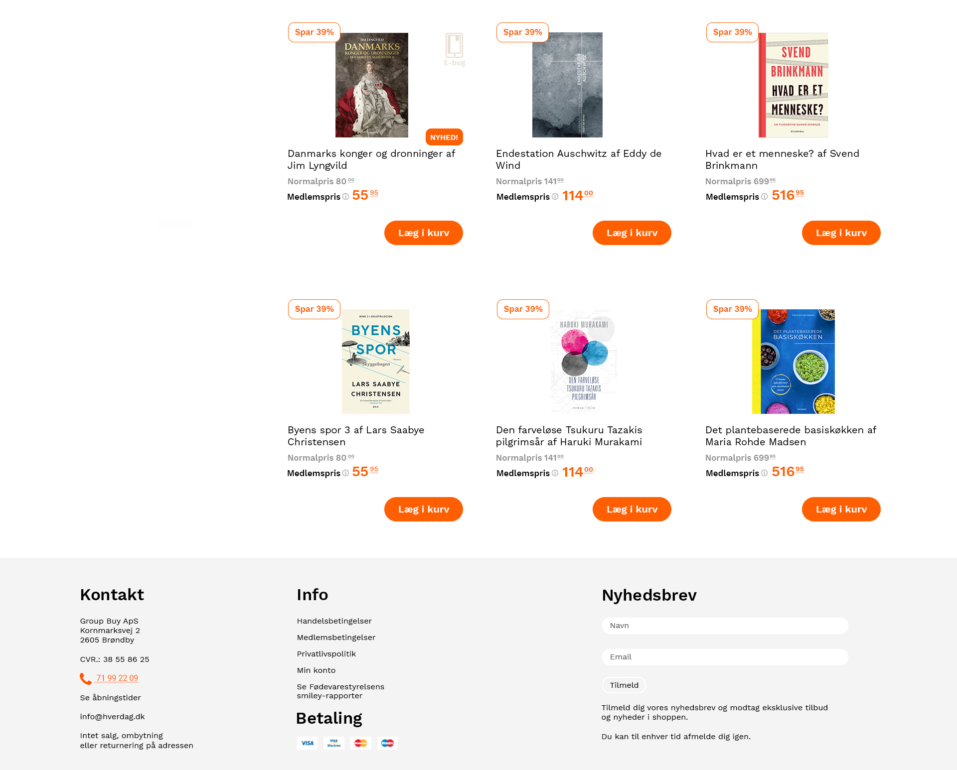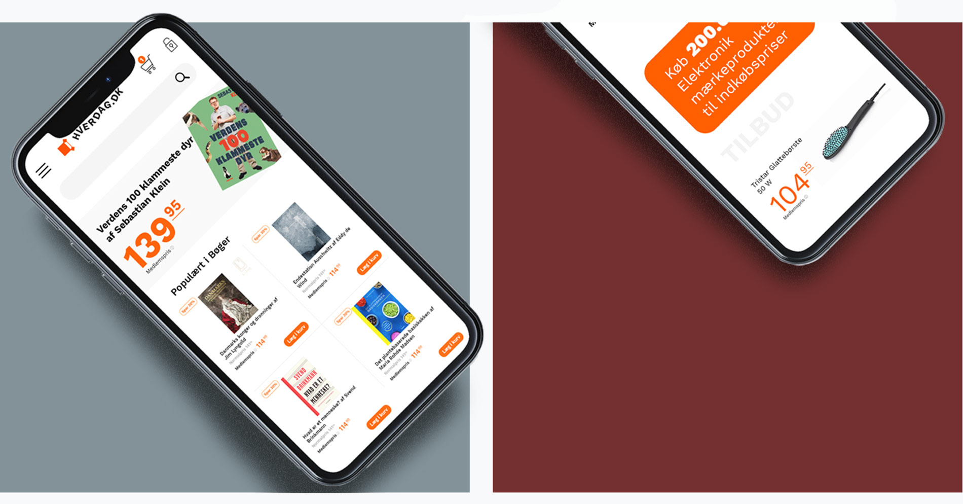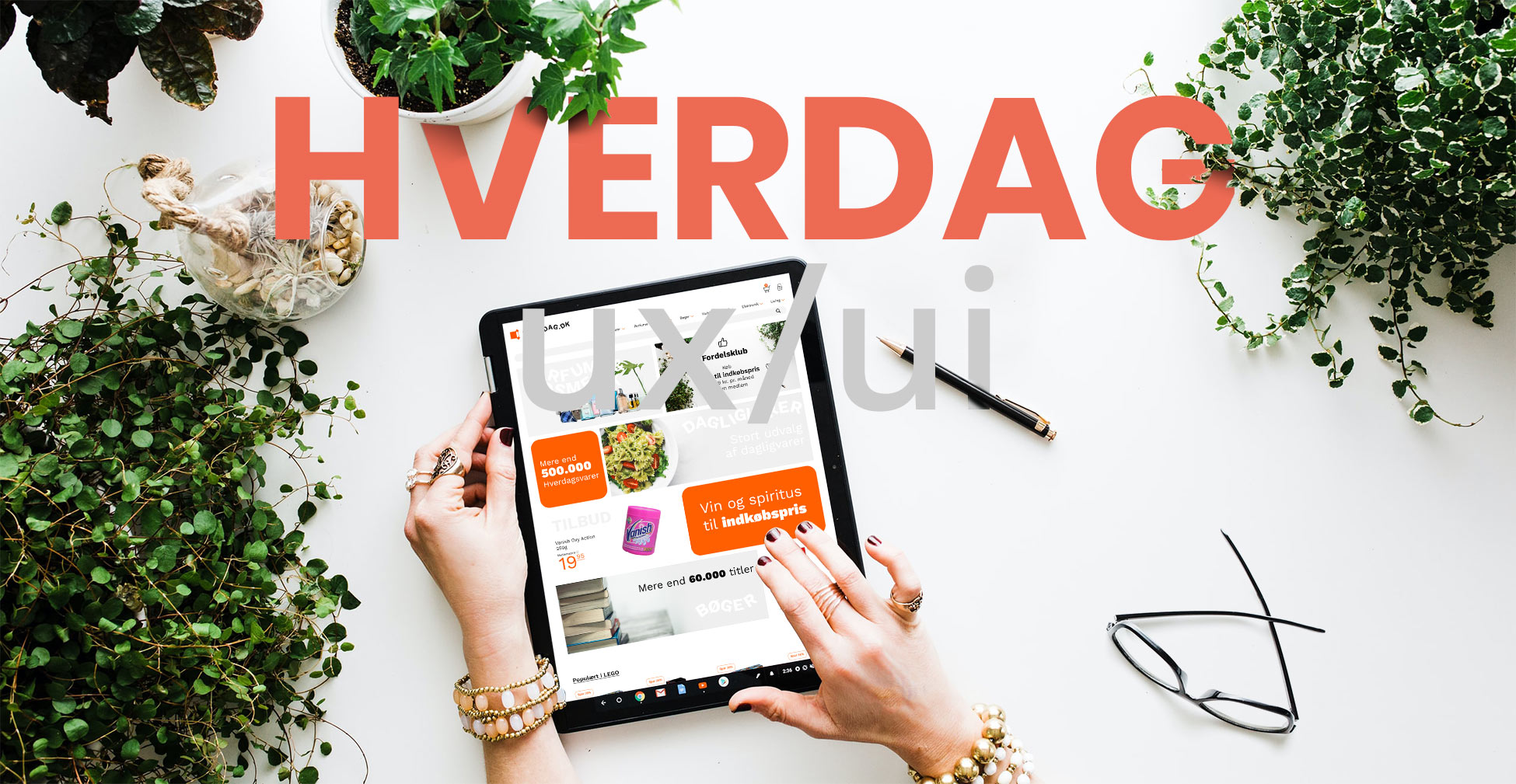
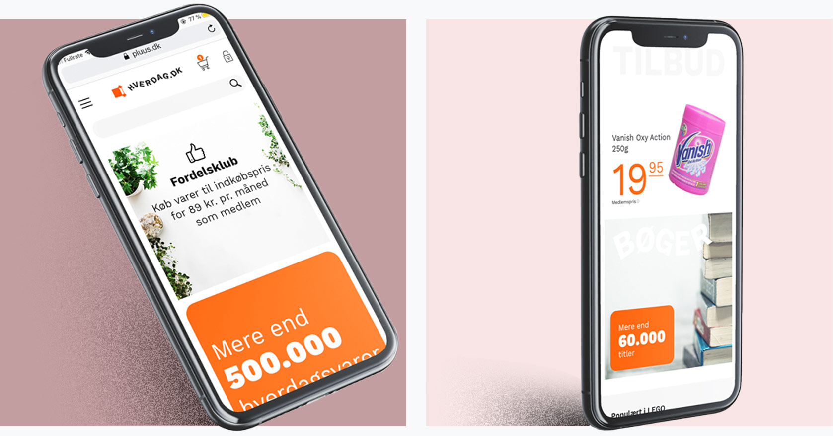
The new shop Hverdag are a combination of Group Buy´s different shops Pluus, garnplus and Buuks. The shop should contain all of the 500.000 different products and show the diversity and width of the shop.
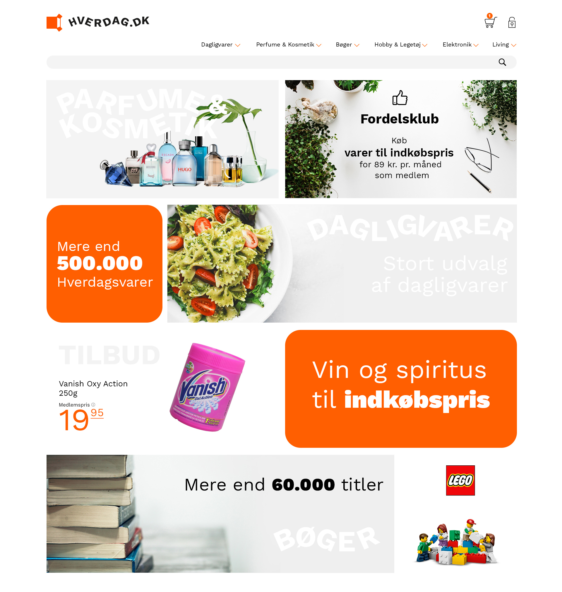
Task – Show the width of the shop on the landing and upsell products from different departments of the shop.
Landing
In order to show the width of the shop I decided to use a grid based layout. The caveat are visual confusion and requires strict control of the Colors. I have solved this by removing the background colors of the products and replace them with a grey nuance or no color at all. This makes the user focus on the product instead of the color.
Product Page
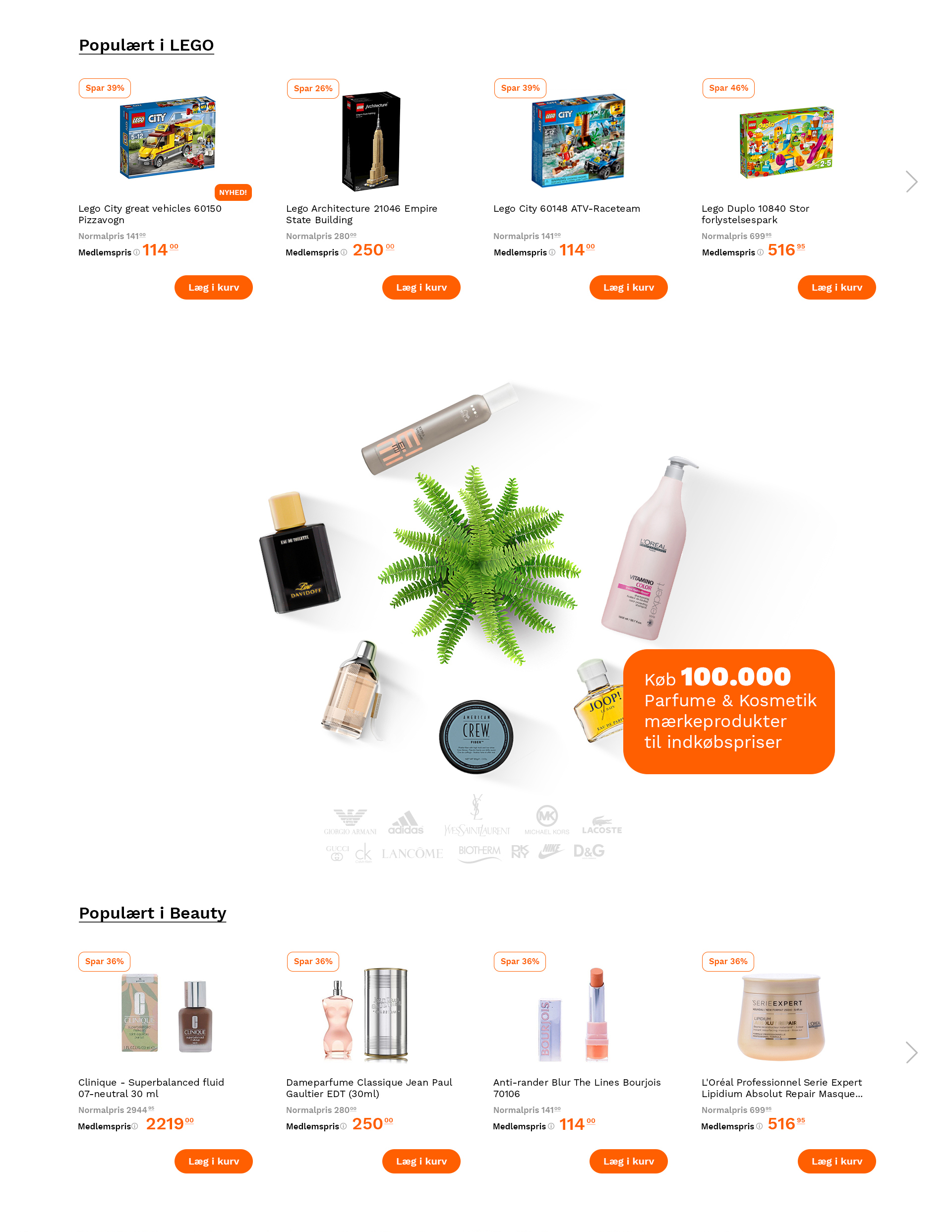
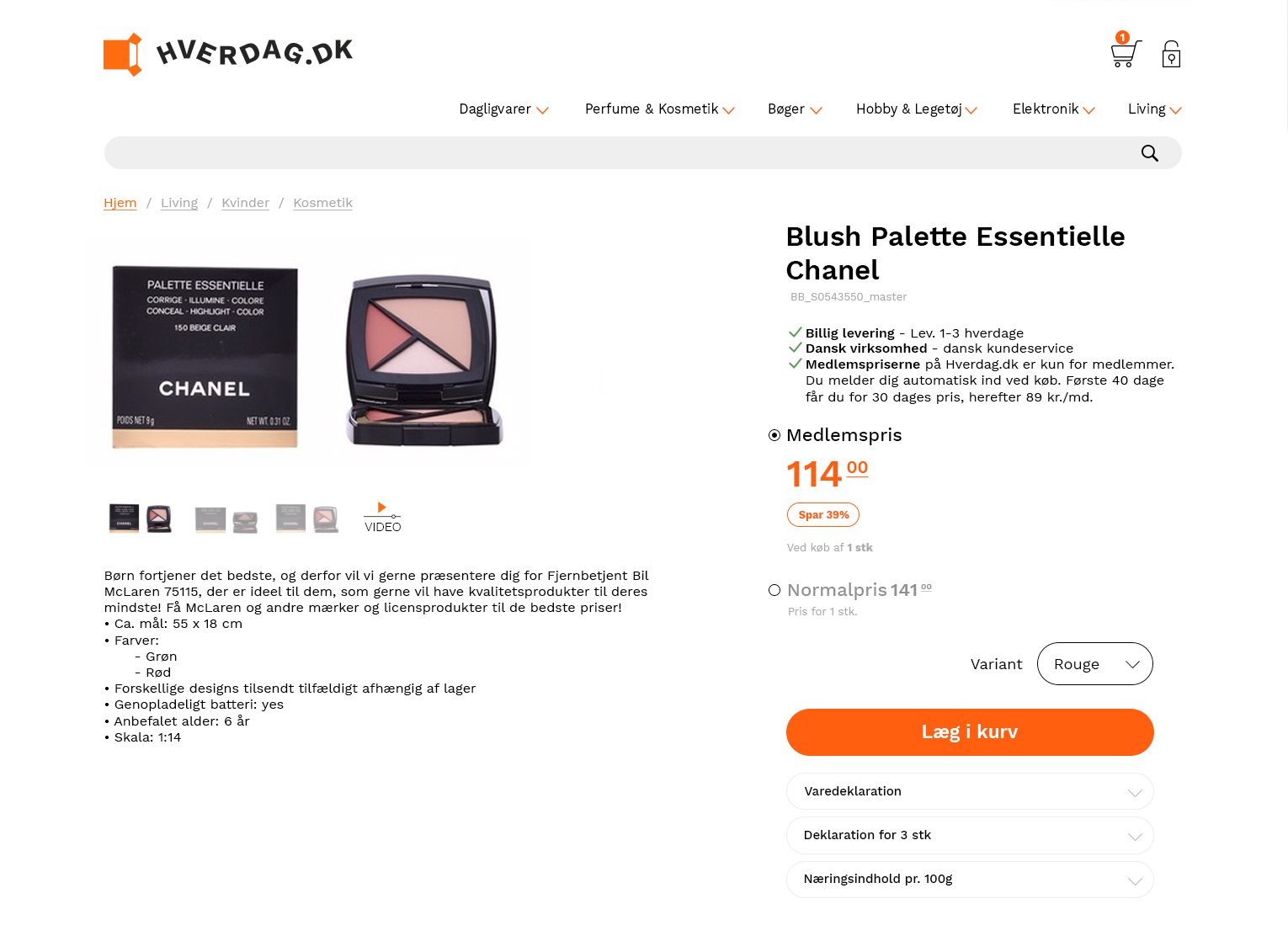
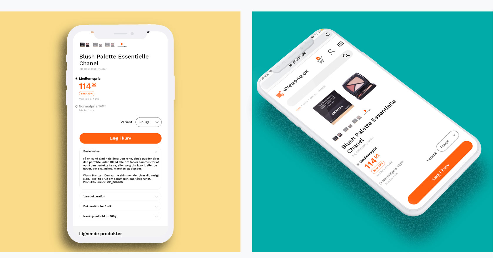
The product page should contain many different functions & elements. I have combined and made some of these elements expandable in order to calm the interface from visual clutter for the user.
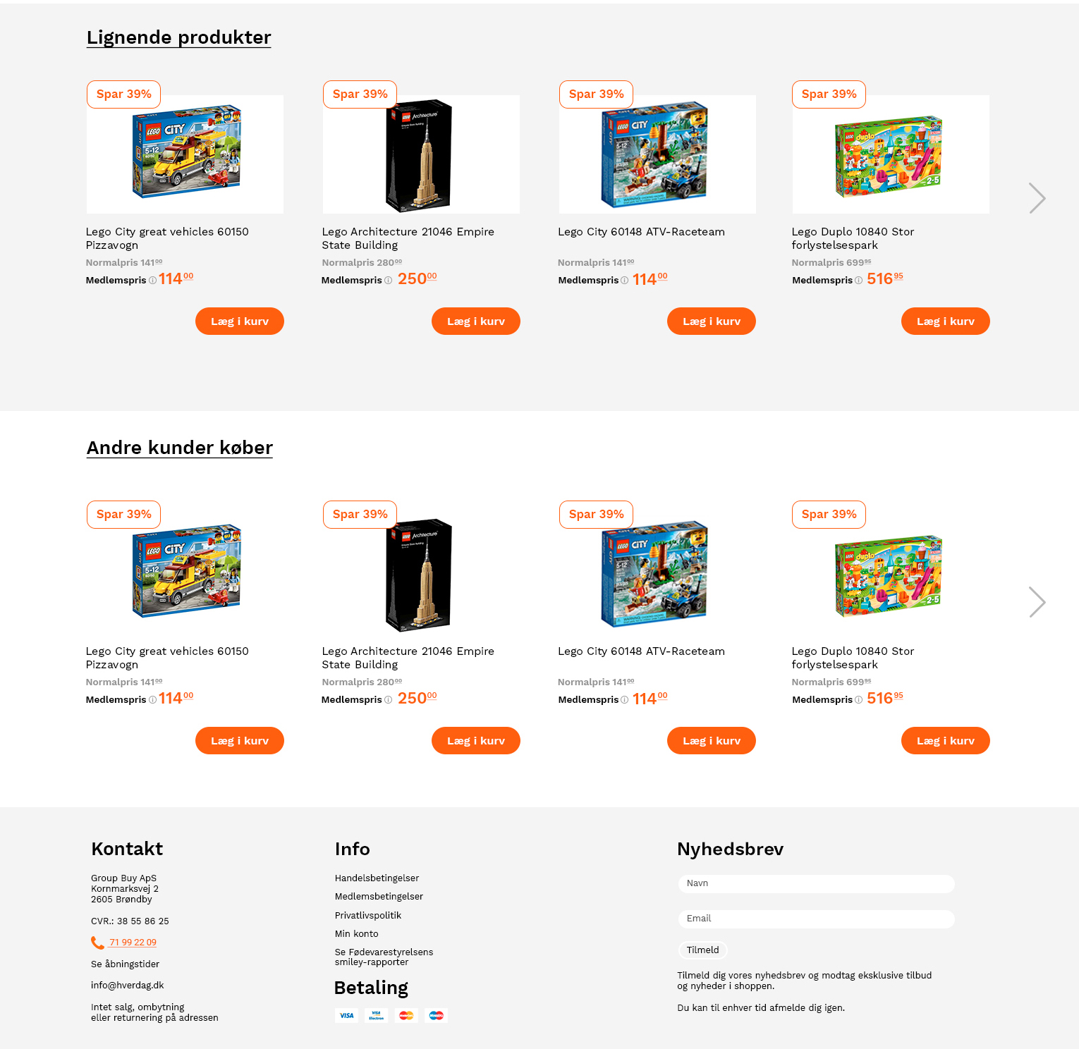
It was important that the user should be exposed to other products in the section after the product presentation, just like in supermarkets. The user are exposed to two categories; Similar Products and Popular Products in the section after the product page in order to up-sell other products.
Payment solution
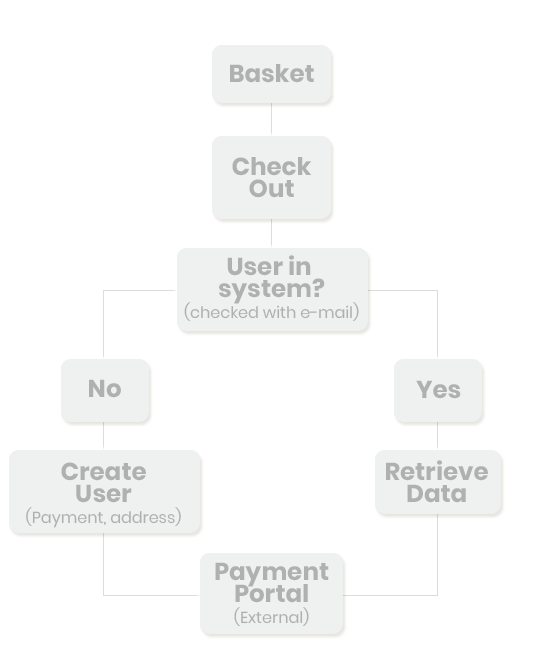
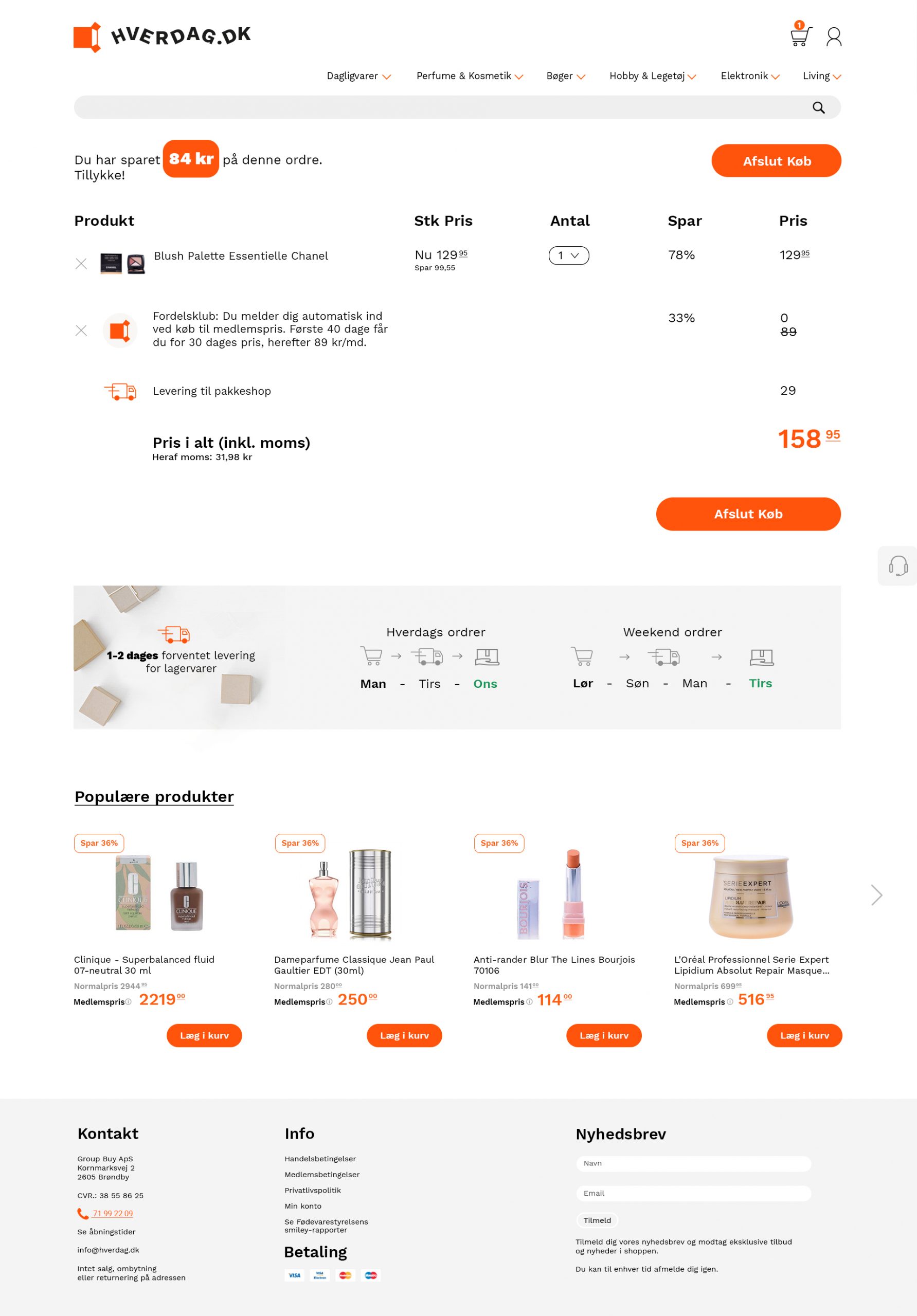
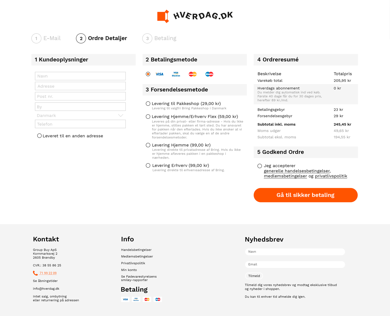
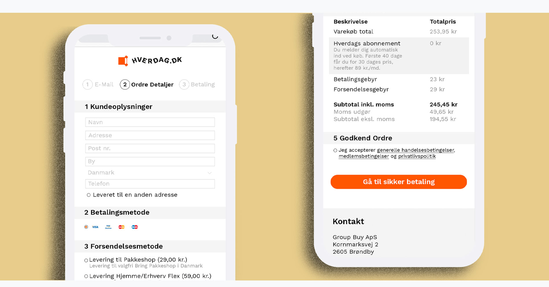
The user are taken from the product page to the basket. The basket are still a part of the site. When pressed Finsh Purchase(Afslut Køb) the user are taken to the check out portal. Firstly the user are validated with an E-Mail, if the user are not in the system they are taken to a create user page to type in their info. The payment portal are external.
Basket
Check Out
Middle pages
On the middlepages it was important that the users quickly could navigate to the part of the department they wanted, without using the top menu. So to solve this problem I have created a mini menu to the left of the products, this menu are sticky and will update the products on the right on click. The header are a carousel, so offers and other content can be exposted to the user.
